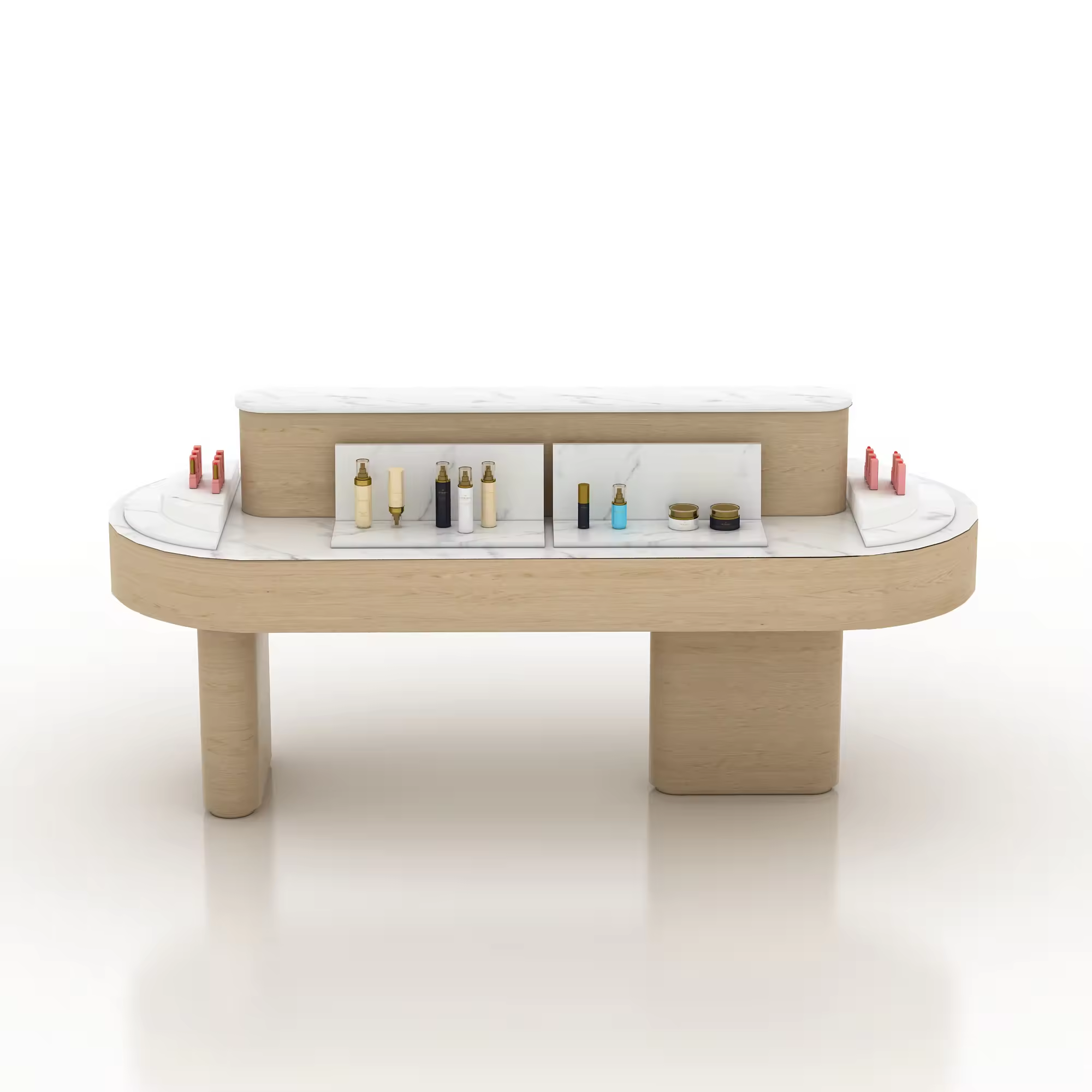
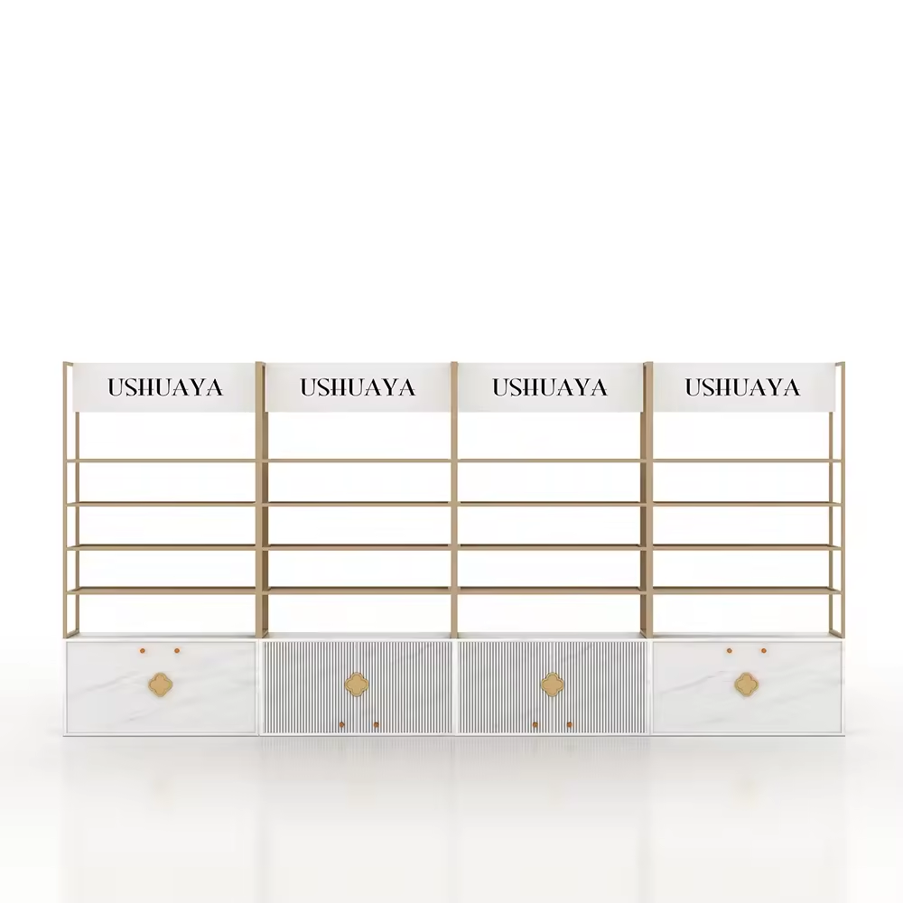
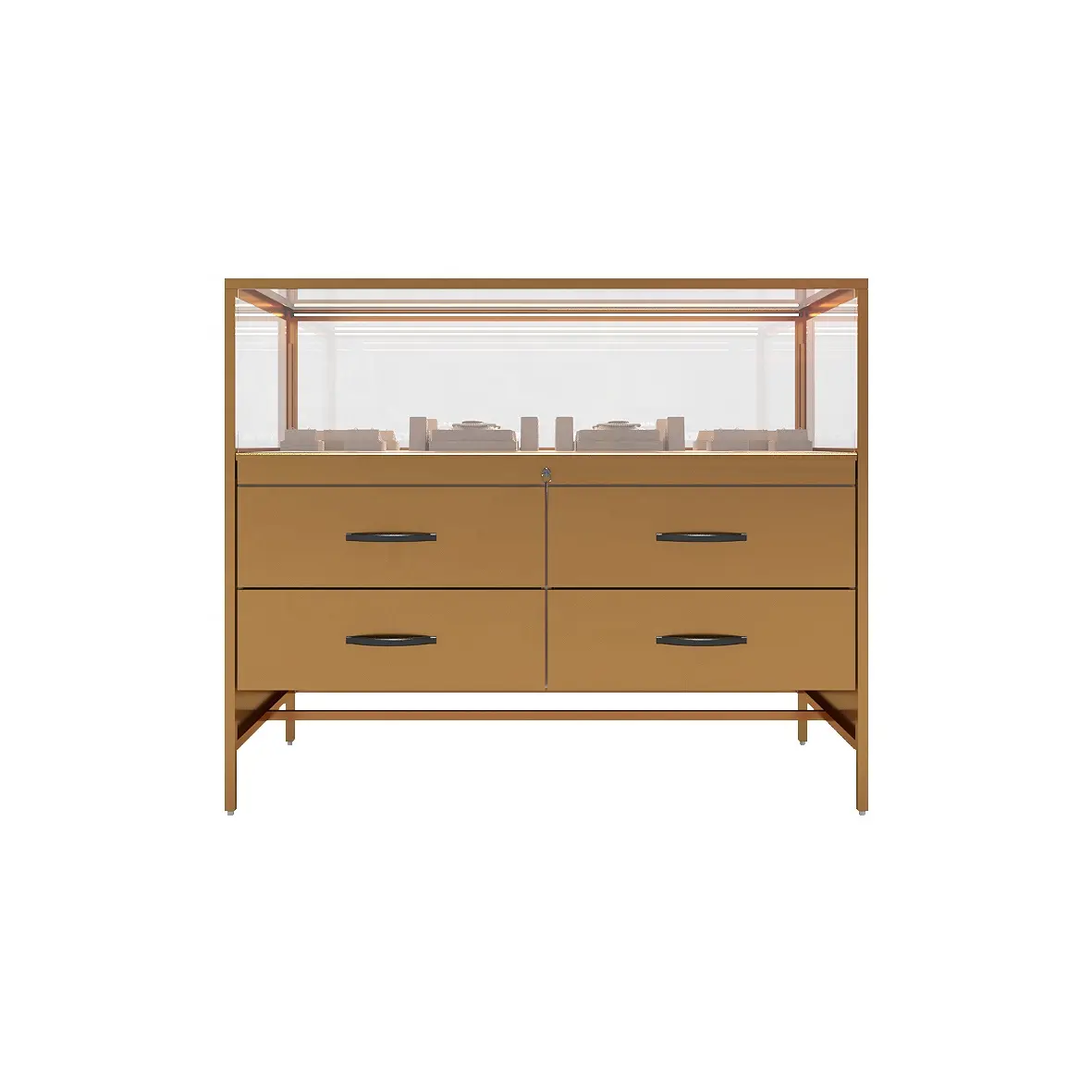
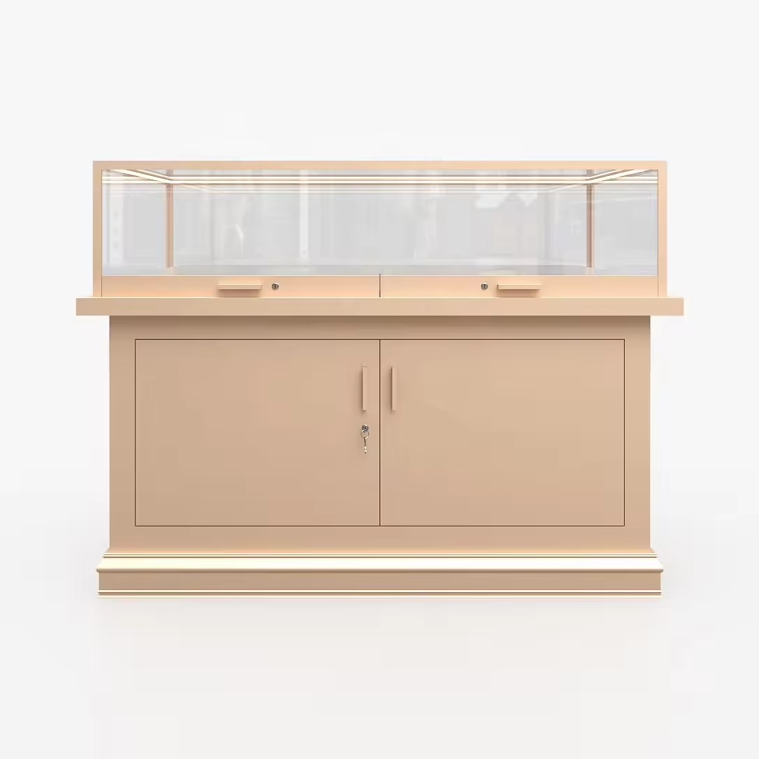
The ‘lightness’ and ‘heaviness’ of a space come more from human associations and perceptions, and objective factors such as the internal materials and colours of the space will exert an influence on such perceptions.
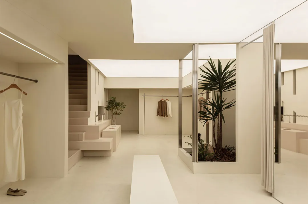
A space with metal and masonry as wall materials will present a heavy texture. While the shop composed of transparent acrylic, giving people the feeling of lightness. Light colours with a high degree of brightness give the impression of lightness, while dark colours with a low degree of brightness give the impression of heaviness.
Although it is said that the lightness of space materials and colours are only a visual response, not the actual weight. However, it is still possible to reduce the weight of a space by using these seemingly ‘lighter’ elements in the design, thus presenting the possibility of lightweighting the space.
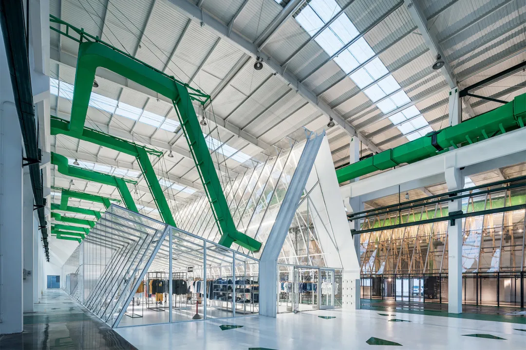
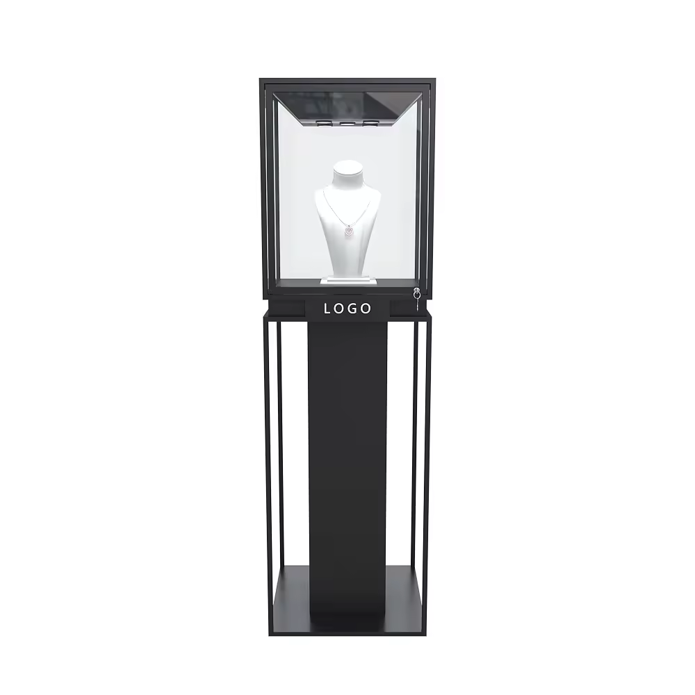
Offline, you will find some brand concept shops, the internal display of a few products, and the kind of dazzling, columns of cabinets in the shop is different, it feels more like shopping in an exhibition. The internal layout of this type of shop reduces the function of sales, and focuses on the presentation of the brand. In other words, the focus is not on sales, but on display.
Under this logic, the shop no longer needs to be stuffed to the brim with merchandise, and the user who wanders through it is no longer overwhelmed by the dense display, and the entire space seems to have become ‘lighter’.
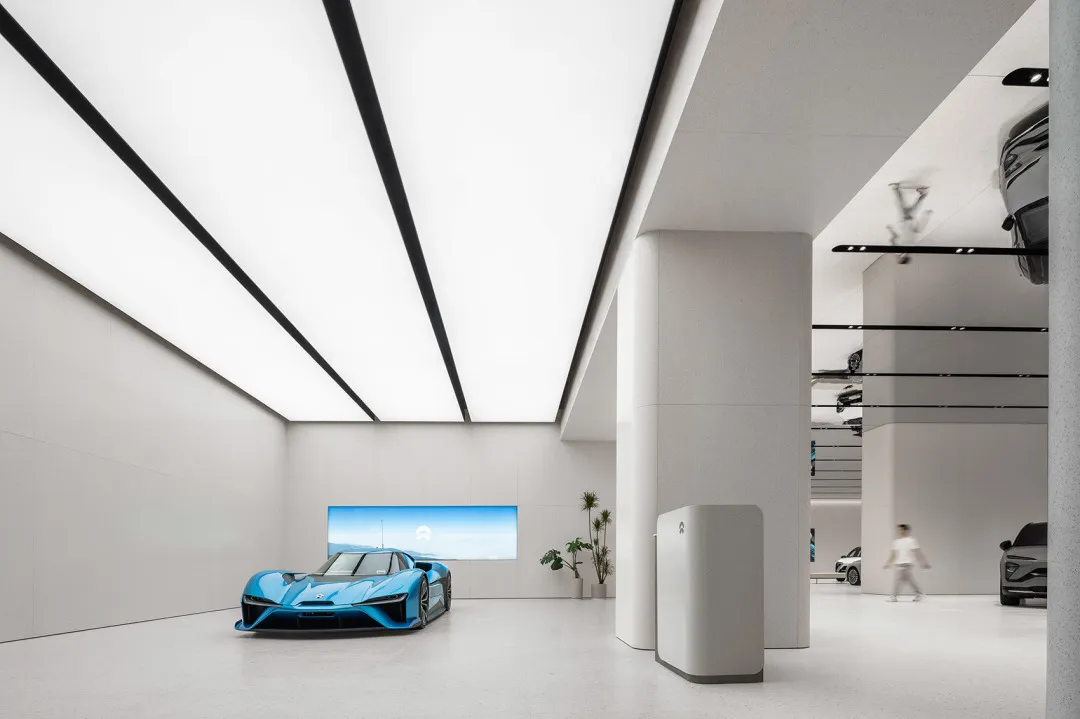
From the brand's perspective, ‘lightweight’ shops can reduce unnecessary space and costs, increase ping efficiency, and at the same time ensure the brand's market coverage.
In the process of brand development, lighter shops are easy to quickly replicate and expand, and in the face of market uncertainty, they can more flexibly respond to various changes.
In short, the shop form of ‘lightweight’, does not mean that the cost is cheap, the essence is still a way to meet the efficiency of improving and responding to changes in the solution to the problem.
