Film is an all-encompassing art that contains almost all forms of art, such as picture composition, scene design, use of light and colour, music, dance, costumes and props.
This form of mobilising all the senses to achieve an artistic effect is almost identical to the essence of retail space design in reality. Pierre Pasolini once said: ‘The whole of life, the whole of its action, is a natural and vivid film’.
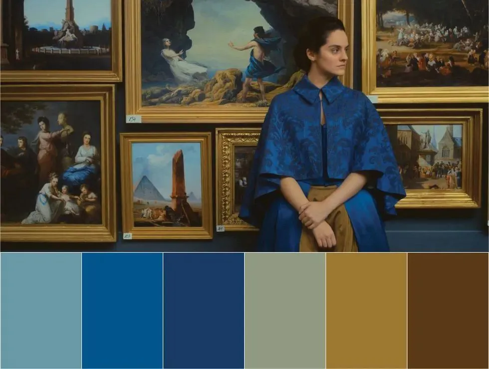
Film originates from the imitation of life, while reality is the inexhaustible source of film creation. Cinema and reality are interdependent, not a parallel space and time without any intersection.
Therefore, some elements in the film have gradually become a kind of figurative scene in the real world, and the everlasting film art has given commercial space a constant stream of design inspiration.
The Grand Budapest Hotel, Romantic Colour Scheme
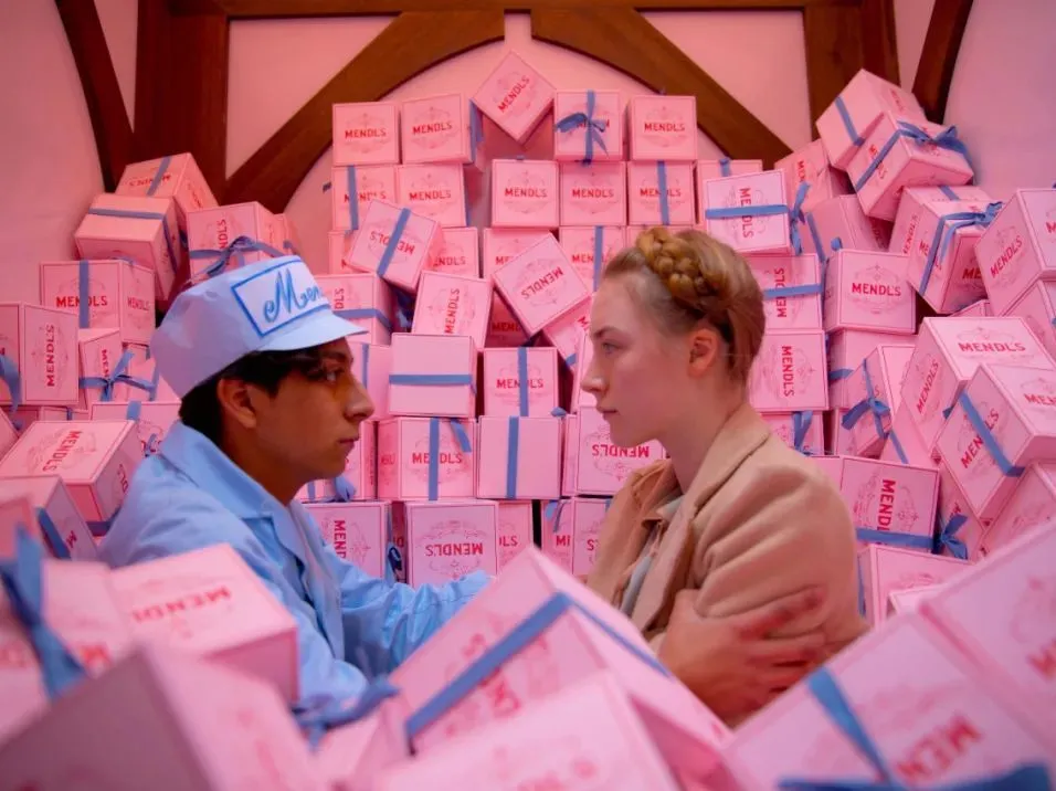
Ghost director Wes Anderson's The Grand Budapest Hotel, a cinema classic, was so beautiful in every frame of the film that it bagged the Oscars for Best Art, Best Costumes, and Best Makeup at the time. The film is filled with dreamy macaron colours, pink buildings, pink skies, and pink shapes, taking the romanticism to the limit.
At the same time, contrasting colours that are far apart in hue, brightness, and saturation are also used in abundance, such as the pink and blue pairing, which gives a strong sense of contrast and makes the picture brighter. In addition to the macramé colour palette, highly saturated colours also appear frequently in the film, with a variety of intense colours being used on a large scale.
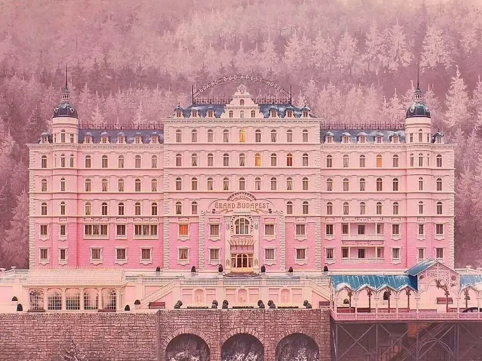
The strong colour aesthetics, as well as the use of symmetrical shots, constitute Wes Anderson's original film style. The Grand Budapest Hotel's clever use of colour, composition and detailed metaphors has led many retail spaces to use the film as design inspiration to recreate Wes Anderson's spaces in the real world.
2001 Space Odyssey, Interdimensional Space
Born in the 1960s, 2001: A Space Odyssey is a sci-fi epic that is regarded as a classic, creating a visionary dream of the future, from the initial evolution of primitive mankind to the eventual annihilation of the stars. The imaginative visual language of 2001: A Space Odyssey also establishes a set of aesthetic formulas for subsequent sci-fi scenes.
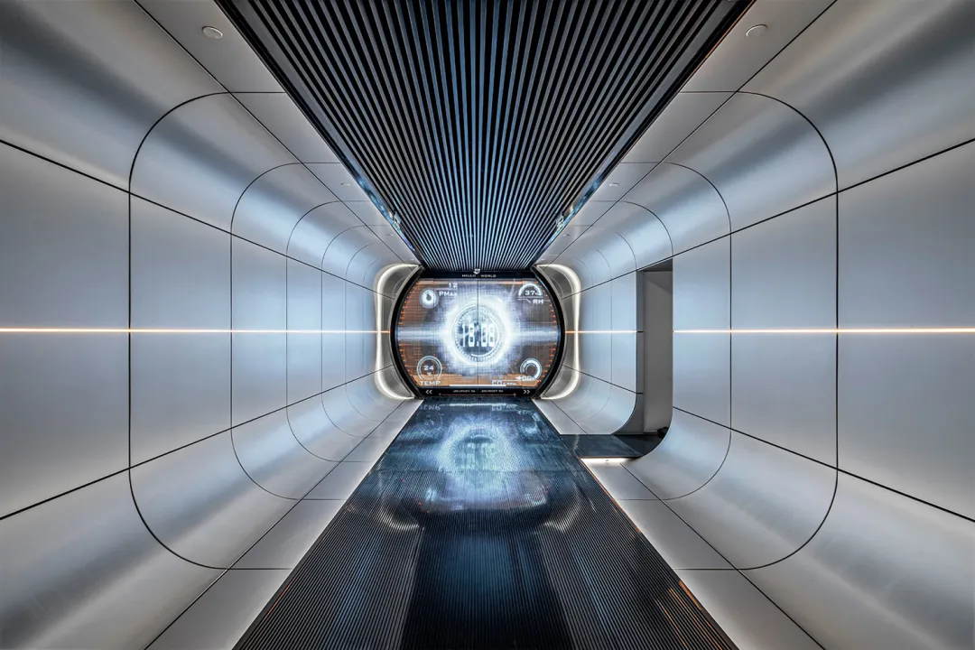
The scenes in J-SPACE space are set for a story about travelling through parallel time and space, as a tribute to 2001: A Space Odyssey, which drew inspiration from the film.
For example, the white space capsule, metallic materials, and the bright lines and shapes of the structure, together build up the visual tone of ‘space aesthetics’. As a result, many shops have borrowed this sci-fi aesthetic to create an interdimensional space full of surprises.
The cracked stone crevices in the lonely valley echo scenes from the ancient times of the film, while the miniature black hole tunnel and the sci-fi sense of the interdimensional eye pay homage to the spacewalking scene. In addition, the space has many counter-intuitive settings, such as the suspended mountain rocks, which seem to be free from gravity, giving a strong sense of floating.
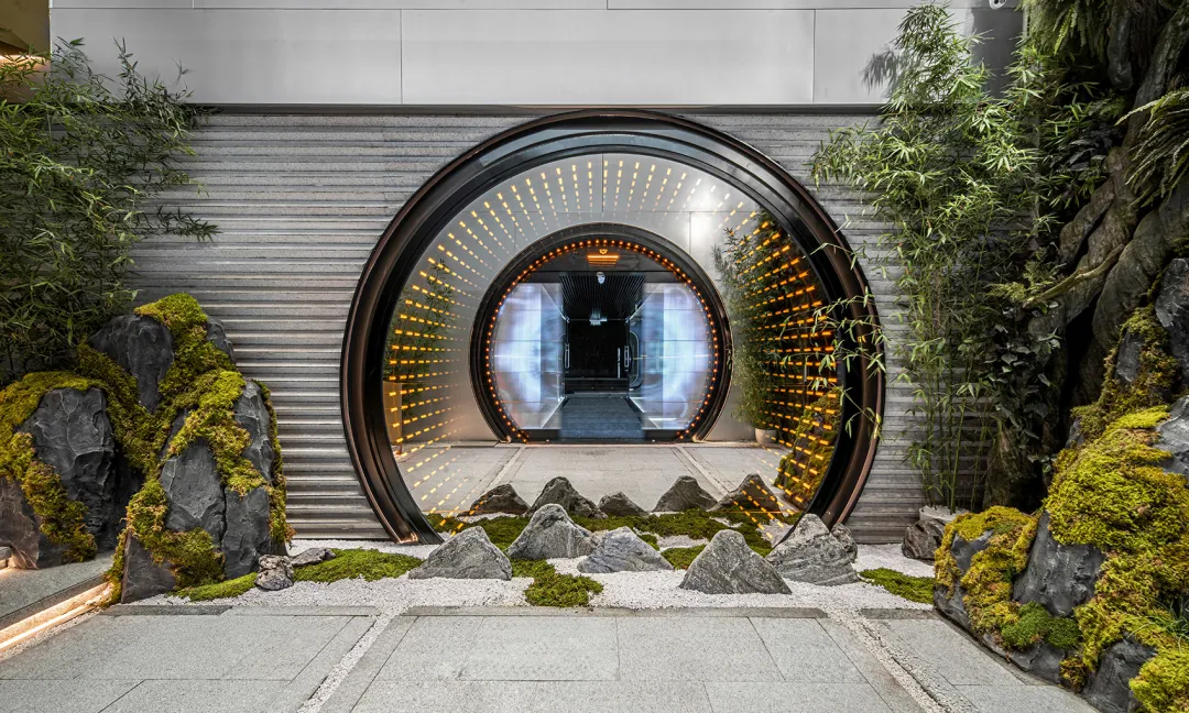
In this space, all functions are combined with scenography, giving users an immersive sci-fi office experience with a strong sense of scene.
The Pianist at Sea, Orphan Eden
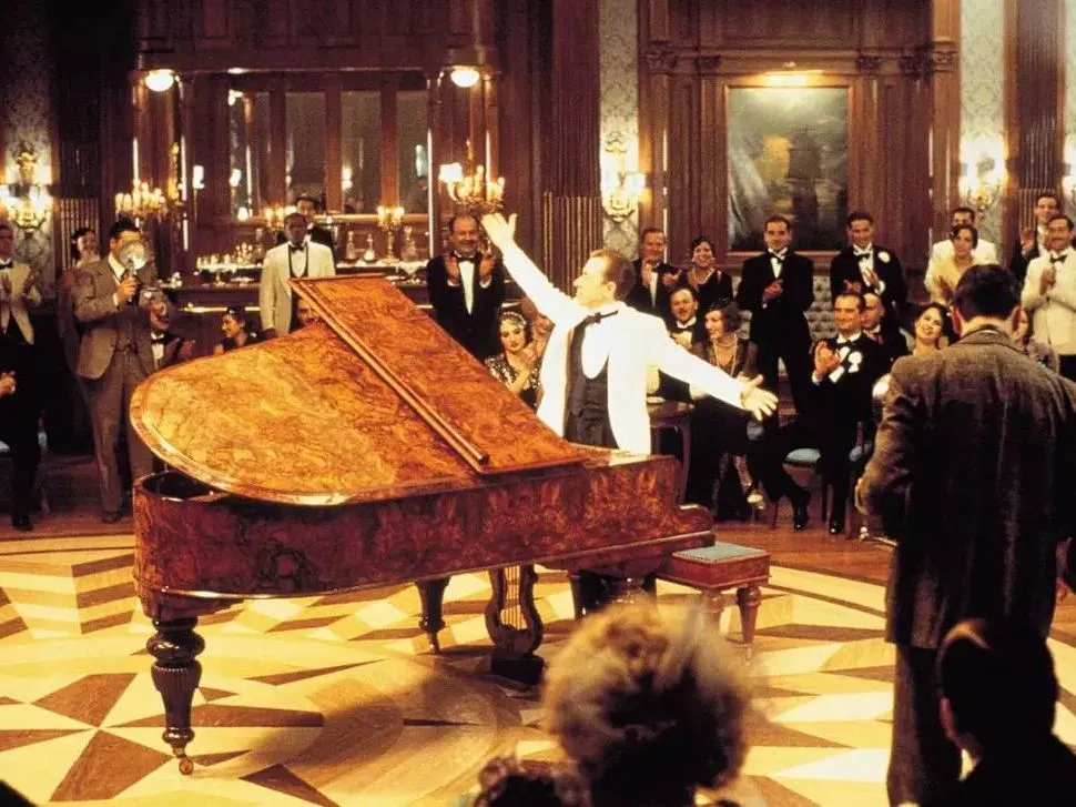
The film The Sea Pianist tells the story of the legendary life of a piano genius. The whole film haunts a retro, somber stylistic tone, with visuals dominated by blue tones that approximate the colour of the sea. The dark tones throughout the film are subtle and introspective, with little bright pigmentation seen, giving a strong sense of tragedy. In the film, ‘boat’ is a very important imagery in the film, which represents an isolated island and is also a metaphor for a Garden of Eden. The isolated space constructed by the boat has also become a scene element for retail spaces.
OF Sanyu Western Bar, a nautical-themed bar inspired by The Pianist at Sea, uses sailing as its main theme to create a temporary escape.
In terms of colour, the shop chose mostly grey as its base, and to fit the theme, the classic red and blue colour scheme of cruise ships was used for the accent colours.
The materials are made of a lot of aluminium, with a few touches of copper for a hint of steam-era mechanics. Old portholes made into mirrors, a medieval heavy-diving helmet converted into a wall lamp, and a hand-painted mural of the seascape in the private room add to the three-dimensionality and immersive feel of this oceanic encounter. The red corridor inside the bar, with its metallic portholes you can see the design of the lapping waves, as if you were in the middle of the Pacific Ocean. Under the decoration of vintage metal lamps, the square porthole light box furnishings slightly reveal the light of the sea, coupled with the dark light of the concordance, in the middle of it, as walking in the real sailing ship.

